Assets
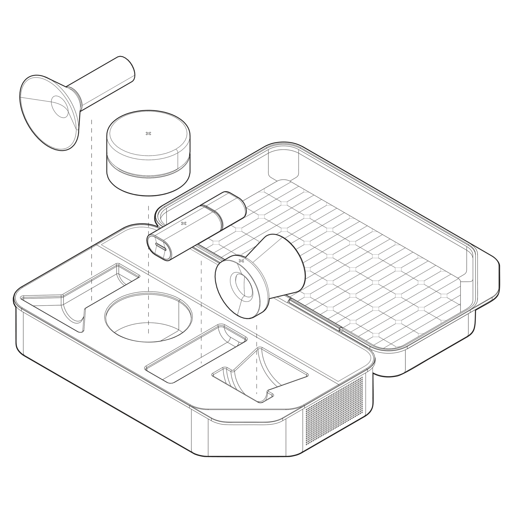
Drawn like an assembly manual: soft fills, clean outlines, pegs and sockets, dashed axes and numbered callouts.
One accent on this page, many in use. Everything here is shown in Clay so the set looks consistent. In real layouts, use the Matter colour of the section instead. One accent per asset.
Every asset lives here. Any new shape, pattern, UI icon, spot icon or illustration, made for any page, is added to its section on this sheet before it ships. If it isn’t here, it isn’t part of the system.
1.3px outline ⬩ 2 soft fills ⬩ dashed axis ⬩ ① calloutsUI icons
Small sizes only, 24 to 64px: 40px on feature cards, 24px in navigation and lists. Icon, then title, then one line of text. Don’t mix with spot icons on the same page.
Lines everywhere. Every edge is outlined in ink; nothing relies on shading alone. Built only from blocks and cylinders, with one Clay part per icon.
Always animated on hover. Every icon moves when its card or row is hovered, and each motion is drawn for that icon: the drawer slides, the lever flips, the keystone drops in. Never a generic wobble, never a static icon.
3D modules ⬩ simpleSpot icons
Large, 120px and up, for section openers and feature highlights. The icon sits on its own dot-grid panel, with title and text below.
Always animated on hover. Every icon moves when its card or row is hovered, and each motion is drawn for that icon: the drawer slides, the lever flips, the keystone drops in. Never a generic wobble, never a static icon.
3D modules ⬩ architecturalIllustrations
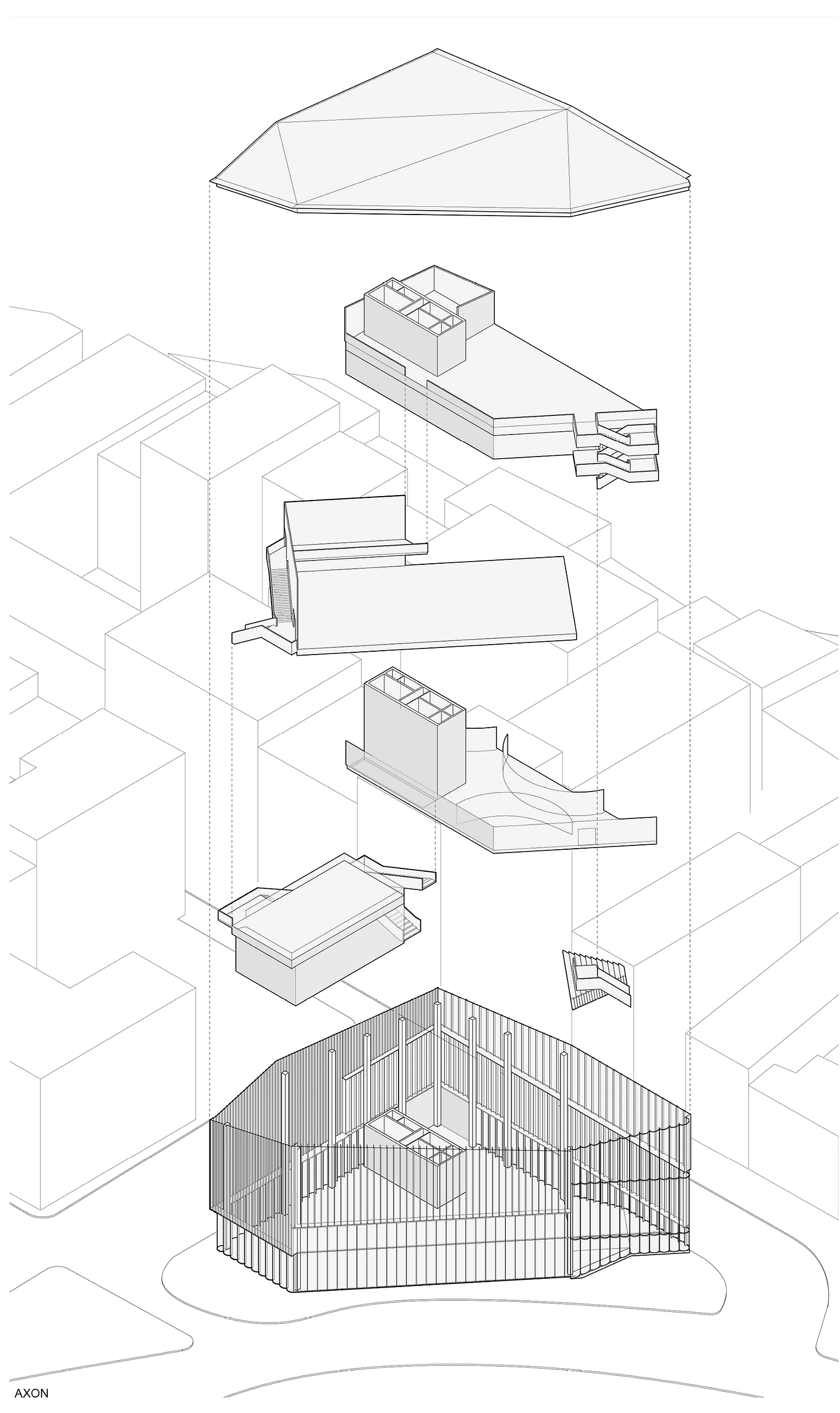
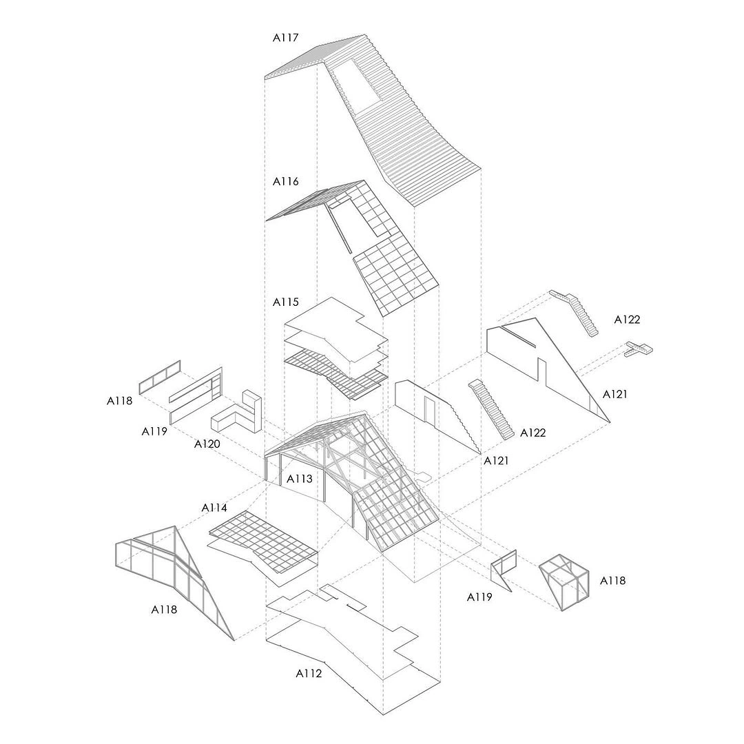
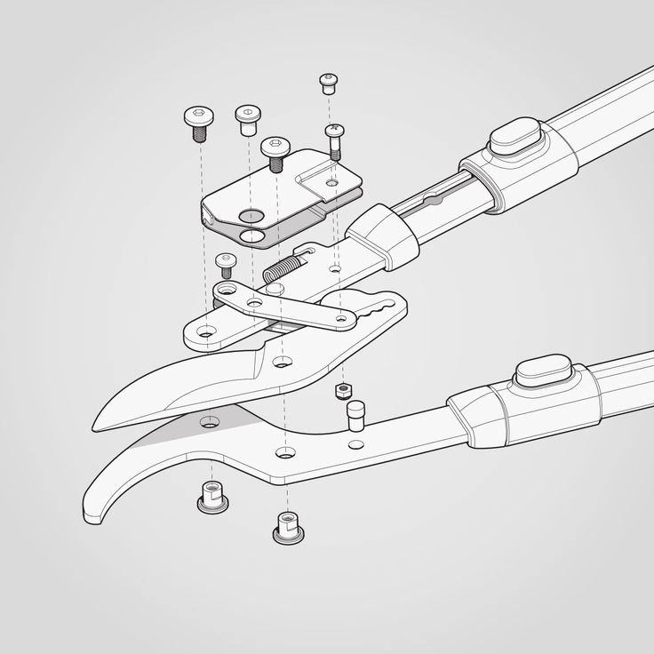
Use one to explain one idea, next to the paragraph it supports. Mono callouts, numbered from the bottom up.
Always parts that assemble. Every illustration is built from separate parts that start apart and come together as the page scrolls, fully assembled when the drawing’s bottom reaches the top 30% of the screen. Never ship one already assembled. Labels stay fixed; only their lines follow the parts. Labels never touch the drawing: keep at least one callout-width of space.
Parts ⬩ assemble on scrollPatterns
Full-width backgrounds and card fills. Crop as needed; put text on a solid panel above.
close-upShapes
Large background graphics, as on sheet 07 of the homepage. Place a shape at 400px or more behind a section: crop it at the edge, show part of it, or split it across the background. Ink on paper, one shape per section.
lines onlyBanners
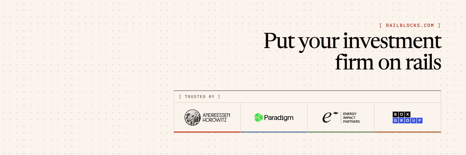
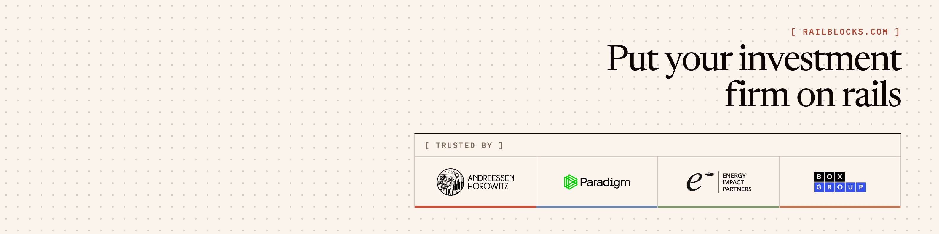
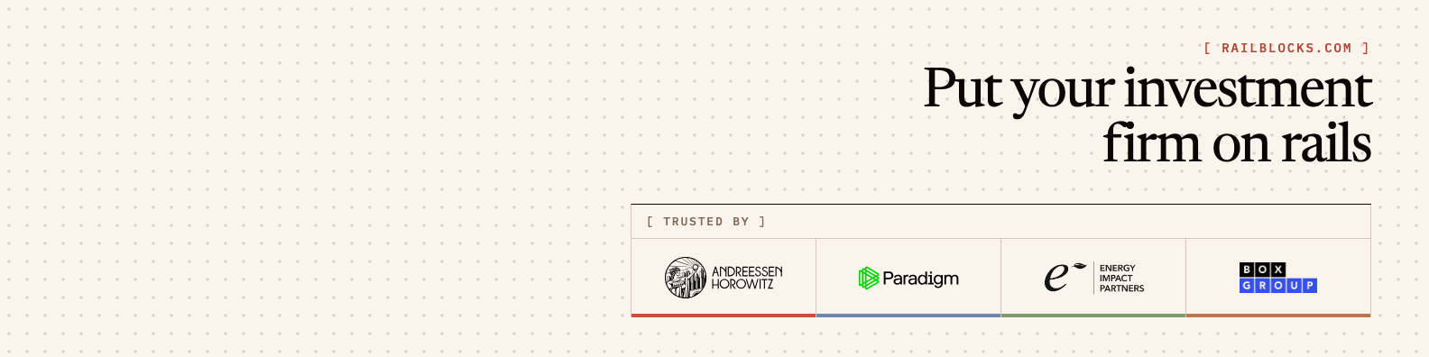
Header images for social profiles. Paper ground with the dot pattern, the tagline top right in Ink with the website above it in Clay, and client logos in a ruled strip bottom right. Keep the bottom left clear: the profile picture sits there. No italics.
X 1500 × 500 ⬩ LinkedIn page 1128 × 191 ⬩ LinkedIn profile 1584 × 396 ⬩ upload the large PNG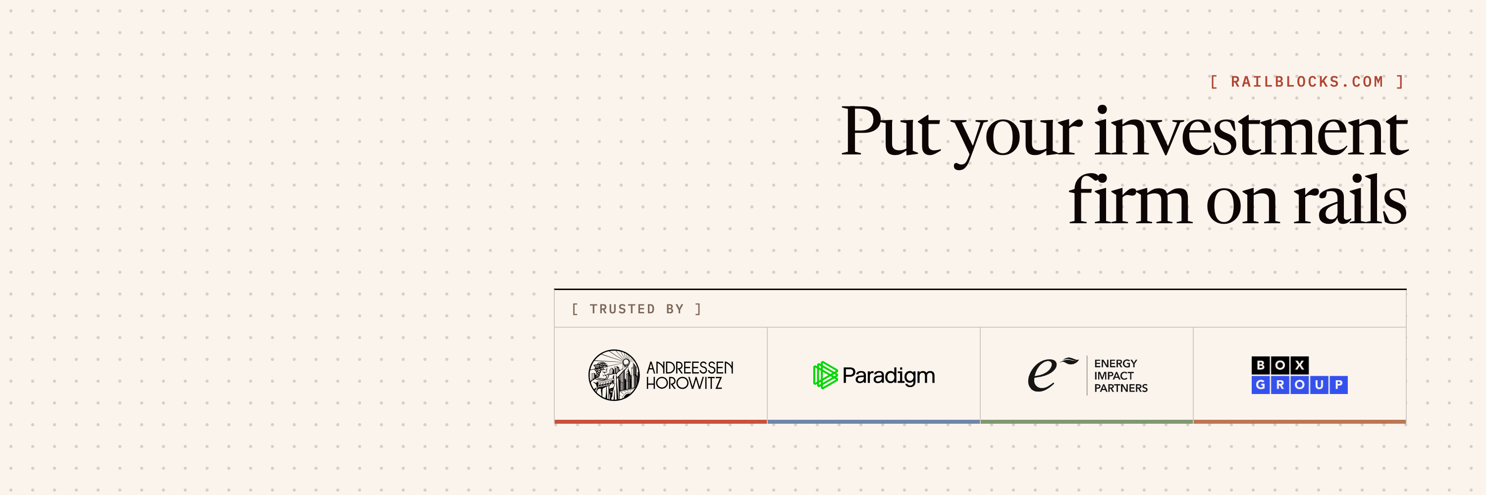


References
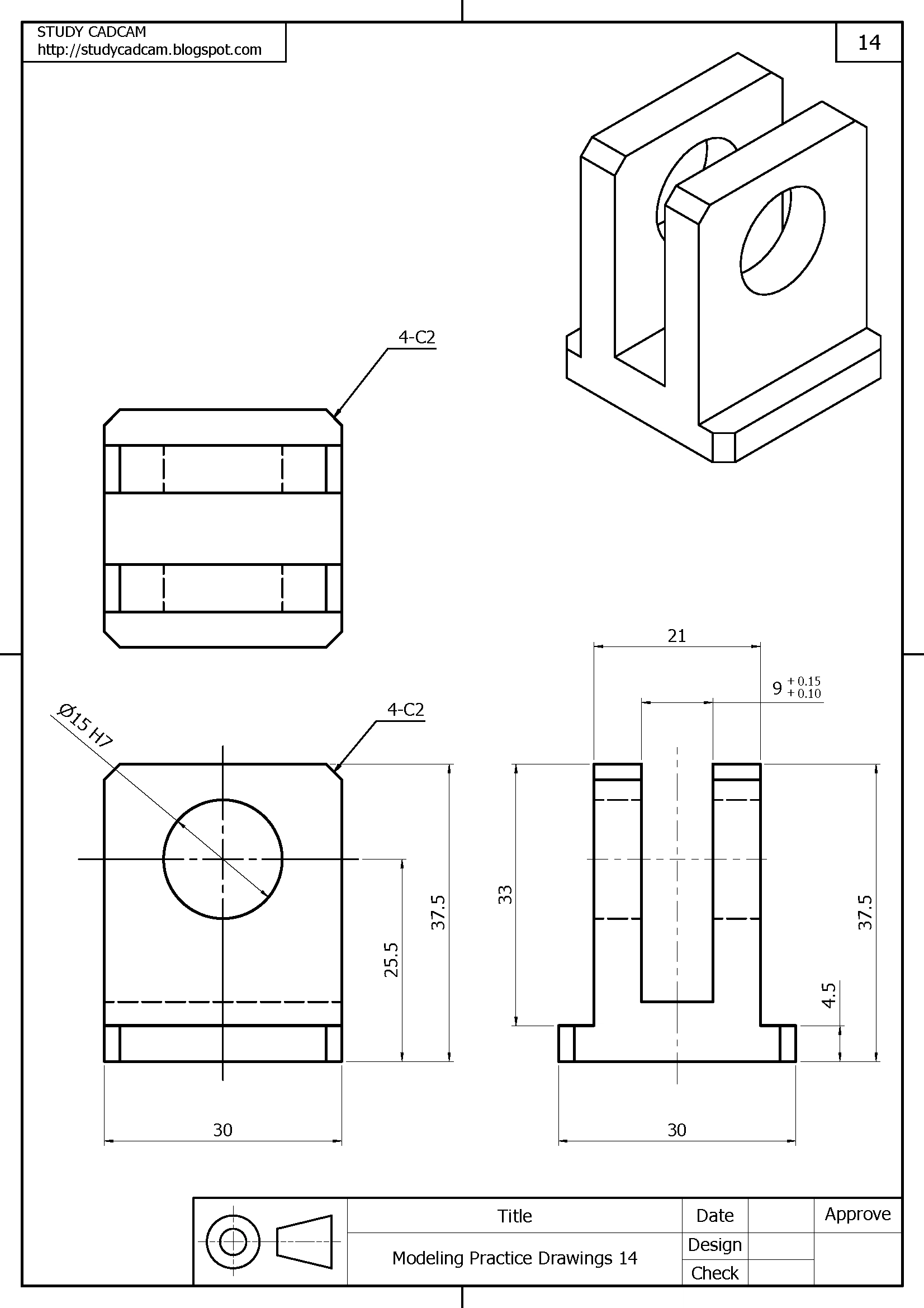
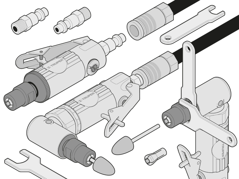
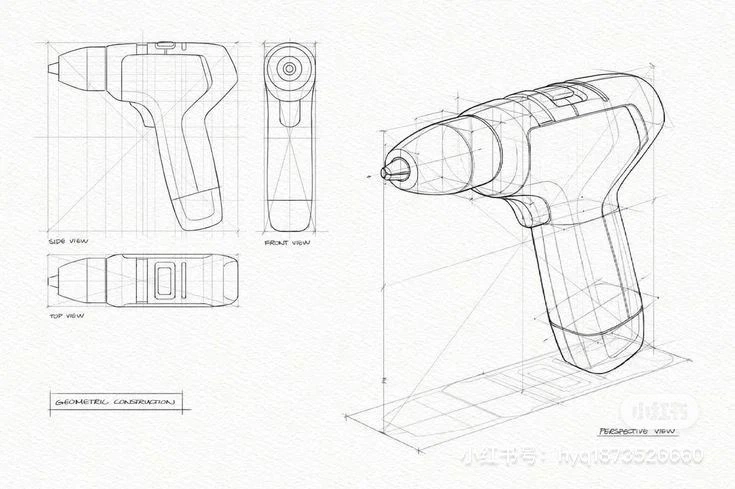
What we borrow from: assembly manuals, axonometric drawings, engineering sheets and kits of parts. Take their line, layout and way of separating parts, never their subjects.
Mood only ⬩ not for use