Railblocks ⬩ Colour
Railblocks
[ Graphic language ⬩ Colour ]

Two palettes.

The Tools are the primary palette: the colours of handmade things such as paper, leather, wood, iron and plaster. They cover every surface, all type and every rule. The Matter is the secondary palette: the materials those tools shape. It is used for buttons, blocks, status marks and the lines that show a connection. The Tools carry the page; the Matter carries the meaning.

[ Section 01 ⬩ Primary palette ]01 / 03
Primary palette⬩~90% of every layout

The Tools

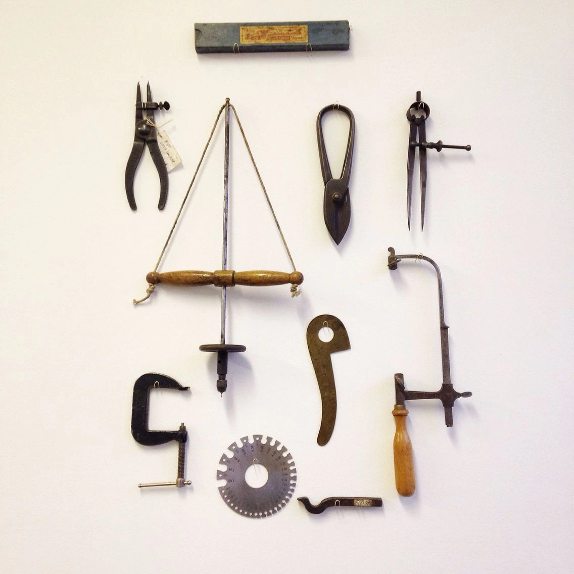
Eight warm neutrals, from warm white to near-black, sampled from a wall of metalworking tools. They make up about 90% of every layout. The Tools fill pages, set paragraphs and draw lines. The warmth is subtle, so accent colours placed on top stand out as objects on a surface.

Primary ⬩ surfaces, type, rules
Metalworking tools on a near-white wallFig. 1 ⬩ Tool wall
Source

Metalworking tools on a near-white wall. The eight steps come from the wall in different light, plus the iron and leather of the tools.

Paper#FBF4EDDefault page background ⬩ cards
Linen#F7F1E9Alternate section bands
Plaster#F4EDE4Table headers, footers, side panels
Chalk#EEE7E2Wells, code, quoted material
Stone#D3C8C4Dividers, chip fills, disabled states
Leather#7E6959Meta, eyebrows ⬩ on Paper only
Walnut#49372DBody copy, captions, labels
Ink#0D0503Headings, primary buttons, dark panels
RefStepHexOn PaperWhat it is for
T1Paper#FBF4ED—The default background for every document, screen and slide. Cards use it too, separated by a hairline rather than a different shade.
T2Linen#F7F1E9—Alternating section bands on long pages. One step darker than Paper, so a new section is visible without a line.
T3Plaster#F4EDE4—Table headers, footers and side columns. Adds structure without a border.
T4Chalk#EEE7E2—Recessed content: code, sample output, pull quotes.
T5Stone#D3C8C49.1 : 1Hairlines, neutral chip fills and disabled controls. The lightest step that can carry Ink text.
T6Leather#7E69594.6 : 1Metadata and mono eyebrows, on Paper only. On Plaster and Chalk its contrast drops below 4.5:1.
T7Walnut#49372D9.2 : 1All body copy, captions and small labels. The default text colour.
T8Ink#0D050316.0 : 1Headings, primary buttons, dark closing panels.
Schedule 01 ⬩ The Tools08 steps
[ Section 02 ⬩ Secondary palette ]02 / 03
Secondary palette⬩~10%, accents only

The Matter

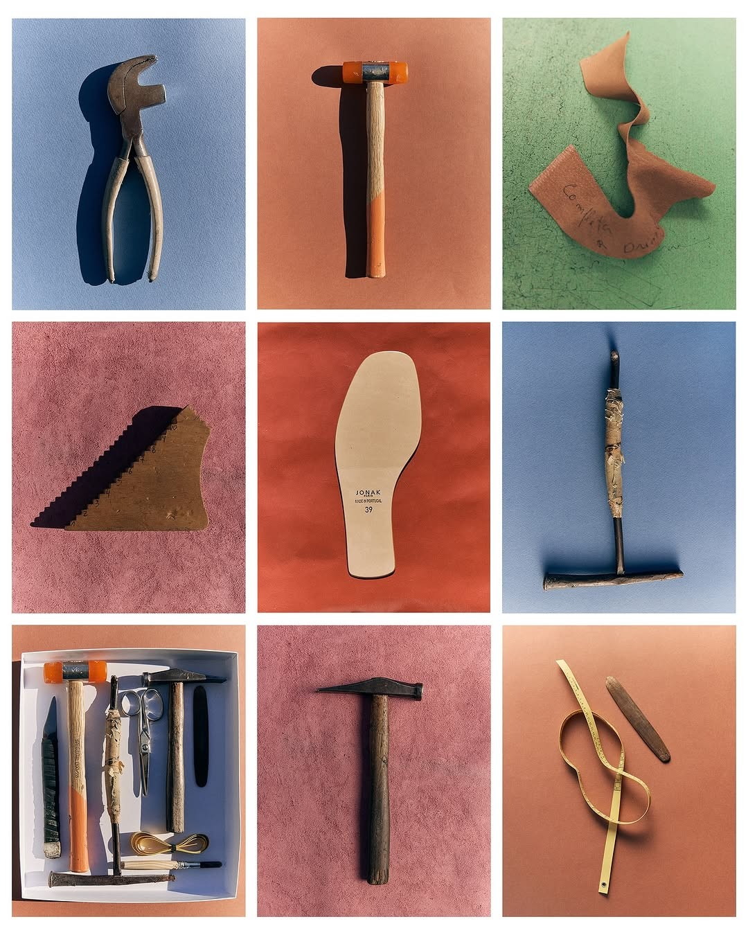
Six matte colours sampled from painted backgrounds in photographs. Use it mostly for small things: a button, a line, a filled block, a status chip, a numeral. Each colour has one job and keeps it: marking a connection, a function, a path or an interaction.

Secondary ⬩ buttons, lines, blocks, marks
Hand tools on flat coloured groundsFig. 2 ⬩ Coloured grounds
Source

Hand tools photographed on flat painted backgrounds. Each colour is sampled from the unlit centre of the sheet, so it reads as paint, not screen light.

Clay#B14633Primary mark ⬩ links, active state
Terracotta#C27153Clay’s equivalent on dark panels
Sage#7F9870Function ⬩ live, running, cleared
Slate#6E86A9Connection ⬩ links between systems
Bronze#BC7752Attention ⬩ needs a decision
Rose#BF7778Editorial ⬩ categories, article marks
RefColourUsed asJob
M1ClayText & fillThe only mark of interaction: text links, the active tab, an accent numeral. At 5.1:1 on Paper, it is the only Matter colour safe for small text.
M2TerracottaText on darkReplaces Clay on Ink panels, where Clay is too dark (5.1:1). Also a warm fill for blocks and arches.
M3SageFill onlySomething is running: a live workflow, a passed check, a cleared item. Not a marketing “growth” green.
M4SlateFill onlySomething connects: data to a workflow, a tool to an agent. Also diagram lines and focus rings.
M5BronzeFill onlySomething needs a person: in review or awaiting a decision. Attention, not alarm.
M6RoseFill onlyEditorial categories: article tags, case-study marks, print accents.
Schedule 02 ⬩ The Matter06 colours
Text-safe variantsSage, Slate and Bronze are fills. When one must be text on a light background, use its darker pair. Text on a Matter fill is always solid Ink.
Sage → #4F6B4C5.4 : 1
Slate → #3F55707.0 : 1
Bronze → #8C46266.4 : 1
[ Section 03 ]03 / 03

Together

The rule is the ratio: about 90% Tools, 10% Matter, mostly spread across small marks. A full Matter background is a rare exception, like the occasional homepage sheet. If two Matter colours are visible at once outside a status list, one of them is decoration.

Proportion & guardrails
Fig. 3 ⬩ Proportion of a typical page
PaperBandsWellsInk
Tools ⬩ ~90%Matter ⬩ ~10%
Fig. 4 ⬩ Buttons and marksRead the philosophy →
LiveIn reviewConnectedCase studyQueued
RefWorkflowStatus
A1Deal intakeLive
A2Diligence assemblyLive
B1LP reportingIn review
B2Portfolio digestQueued
Fig. 5 ⬩ Lines and status04 rows
01 ⬩ Path

Deal intake

One reviewed route per process.

02 ⬩ Function

Diligence assembly

Context gathered before a partner opens it.

03 ⬩ Connection

LP reporting

Linked to the systems that hold the numbers.

04 ⬩ Attention

Portfolio digest

Waiting on a human decision.

Do+ Always
01Start every layout on Paper, and let hairlines do the separating.
02Use hairlines before shadows; Stone is the divider, not a drop shadow.
03Give each Matter colour one job and keep it: Sage always means running.
04Put full-opacity Ink on every Matter fill.
05Let one Clay mark per view carry the interaction.
Don’t− Never
01Use a Matter colour as a section background by default. Keep it rare, like the occasional homepage sheet.
02Set body copy in Sage, Slate or Bronze. Use the darkened text pairs.
03Use Leather on Plaster or Chalk; it falls below 4.5:1 there.
04Gradient, glaze or blend any of these colours together.
05Reach for a Matter colour to mean “important” rather than “this connects to that”.