1
Arch
The tunnel a firm moves through as it changes.

Three parts: the symbol and how to use it at each size, the wordmark beside it, and the colour pairs the lockup can appear in.
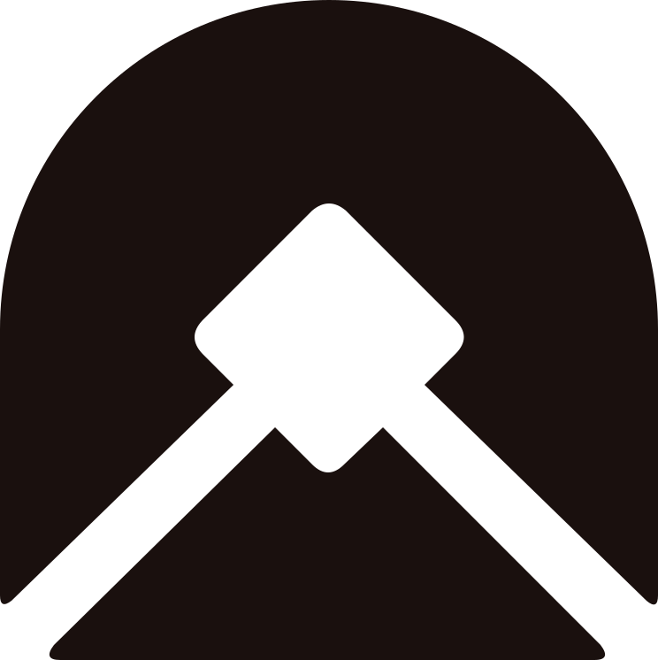
The symbol has three parts. A round-topped arch: the tunnel a firm moves through as it changes. A chevron across it: the rail, and progress along it. A diamond keystone at the top: the block that holds the structure together, standing for both our building blocks and the finished OS. All three are drawn in negative space.
rails ⬩ blocks ⬩ the tunnel forwardThe tunnel a firm moves through as it changes.
Crosses the arch. The rail, and progress along it.
The block at the top that holds the structure together.
 12056322014 ⬩ floor
A custom serif drawn to match the symbol. From the symbol, it takes the same stroke weight, straight-cut ends and sharp corners. From Newsreader, our heading font, it takes its proportions and classical feel. All letters share one height, so the word reads as a single block. The wordmark and the site headings speak with one voice.
the logo’s solidity ⬩ Newsreader’s elegance 300px ⬩ cap 40px180px ⬩ cap 24px ⬩ floorMark only
One flat colour on one flat background. Only these ten pairs are allowed.
one ink ⬩ one ground ⬩ never twoThe browser tab, bookmark and home-screen icon. The mark alone, in paper, centred on a square of ink. The mark takes up half the tile, so the clear space is built in.
paper on ink ⬩ mark at ½ ⬩ square ×
×rb-favicon.svg, scaled. Don’t redraw or re-centre the mark.The supplied files. SVG for screens and print, at any size. PNG where SVG can’t be used: transparent, 3000px wide for the lockup, 1024px for the mark and favicon.
svg ⬩ png ⬩ transparent